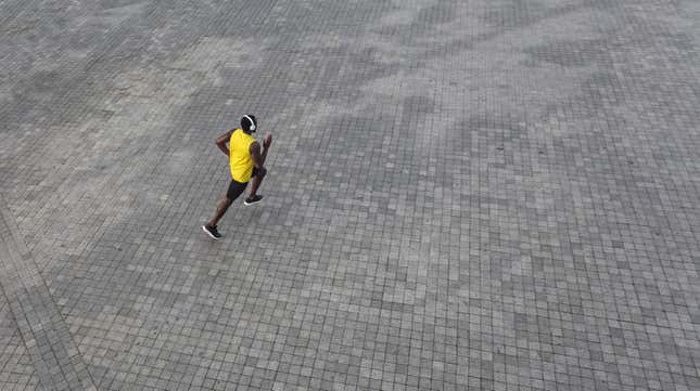
What colors would you say reflect an era filled with uncertainty, angst and sheer frustration—one in which there, at last, appears to be a light at the end of a very long time-loop tunnel, but no one really knows exactly when—or how, things will begin to feel even remotely right-side-up again (if ever).
If you’re on the color forecasting team at Pantone, maybe the only way to translate the mood of the moment into color is to consider it a study in contrasts. After choosing the stable, calming and (let’s just say it) boring “Classic Blue” for 2020—a year that was anything but (maybe they were subversively trying to sway the vote? I’m sure Trump and Co. would say so), the newly announced Color—err, Colors of 2021, “Ultimate Gray,” and “Illuminating” (“a bright and cheerful yellow”) are simultaneously somber and optimistic; perhaps subconsciously communicating that we’d be wise to manage our expectations in this new year.
As described by Pantone:
PANTONE 17-5104 Ultimate Gray + PANTONE 13-0647 Illuminating, two independent colors that highlight how different elements come together to support one another, best express the mood for Pantone Color of the Year 2021. Practical and rock solid but at the same time warming and optimistic, the union of PANTONE 17-5104 Ultimate Gray + PANTONE 13-0647 Illuminating is one of strength and positivity. It is a story of color that encapsulates deeper feelings of thoughtfulness with the promise of something sunny and friendly.
A message of happiness supported by fortitude, the combination of PANTONE 17-5104 Ultimate Gray + PANTONE 13-0647 Illuminating is aspirational and gives us hope. We need to feel that everything is going to get brighter – this is essential to the human spirit.
...
Emboldening the spirit, the pairing of PANTONE 17-5104 Ultimate Gray + PANTONE 13-0647 highlights our innate need to be seen, to be visible, to be recognized, to have our voices heard. A combination of color whose ties to insight, innovation and intuition, and respect for wisdom, experience, and intelligence inspires regeneration, pressing us forward toward new ways of thinking and concepts.
Uhh...OK, I guess. I mean, gray is gray (and wearable pretty much everywhere and with everything), but how did they somehow manage to pick one of the least enchanting shades of yellow imaginable? Having been a child in the ’80s, this color combo—which is meant to be paired together at all times—most vividly called to mind a splatter-painted sweatshirt I wore incessantly in junior high (which, come to think of it, would likely be back in style now). Yet despite my juvenile association, it’s ironically also a combination Teen Vogue plainly called “really weird,” writing:
As usual, Pantone’s choice strikes me as rather tone-deaf and half-hearted, gesturing clumsily towards current events without taking any identifiable political stance...And perhaps that’s the biggest reason I dislike this choice. It feels wishy-washy and vague. Pantone has such a great global reach, I wish it either stop trying to hitch its color trends to current events, or pick something more meaningful. Medical Mask Blue, for instance, as a reminder that we’re not through this crisis yet and we still need to be masking up. Or Ultimate Gray, as a reminder that the future is always a vast unknown space, no matter how much we project our desires onto it.

Honestly, “Medical Mask Blue” (which I imagine might look something like this) sounds both practical and more appealing as a hue—a color that both connotes safety and can be coordinated with a vast array of scrub-like, minimalist fashions (fitting for what feels like a post-war moment) as we await the distribution of the vaccine—and then wait God knows how much longer for enough people to take it so we can achieve that elusive and oft-misunderstood “herd immunity.” But regardless, what we really need right now is some inspiration to see us through—and sadly, Pantone, this ain’t it.


